
See also: Lettering
Introduction
Now we begin our discussion of the ABC’s of engineering drawings – literally. Lines, letters, and numbers are what engineering drawings are made of. In the United States, the predominate standard is ASME Y14.2M – Line Conventions and Lettering. Adherence to a standard guarantees consistency and readability between companies or agencies. Students should understand the standard use of lines and how to produce standard text for use in letters and numbers.
Line Conventions
A fundamental part of the language of engineering graphics the meaning conveyed by different types of lines. The thickness and form of a line, as well as its relationship to other lines communicates important information. Know all of the line types by heart, they are fundamental to your understanding of a drawing. All lines must be clear, sharp, and opaque; they should have definite start and end points. Lines should be of two thicknesses: thin or thick. Thin lines should be a minimum of .3 mm thick on the printed drawing. Thick lines should be twice as thick as the thin lines.
Although it was not always the case, most CAD systems today can produce lines in varying thicknesses. Be sure to understand how to take advantage of this functionality with the system you will be using.
Line Conventions
- Visible Lines
- Hidden Lines
- Center Lines
- Dimension and Extension Lines
- Leader Lines
- Arrowheads
- Symmetry Lines
- Cutting Plane and Viewing Plane Lines
- Section Lines
- Phantom Lines
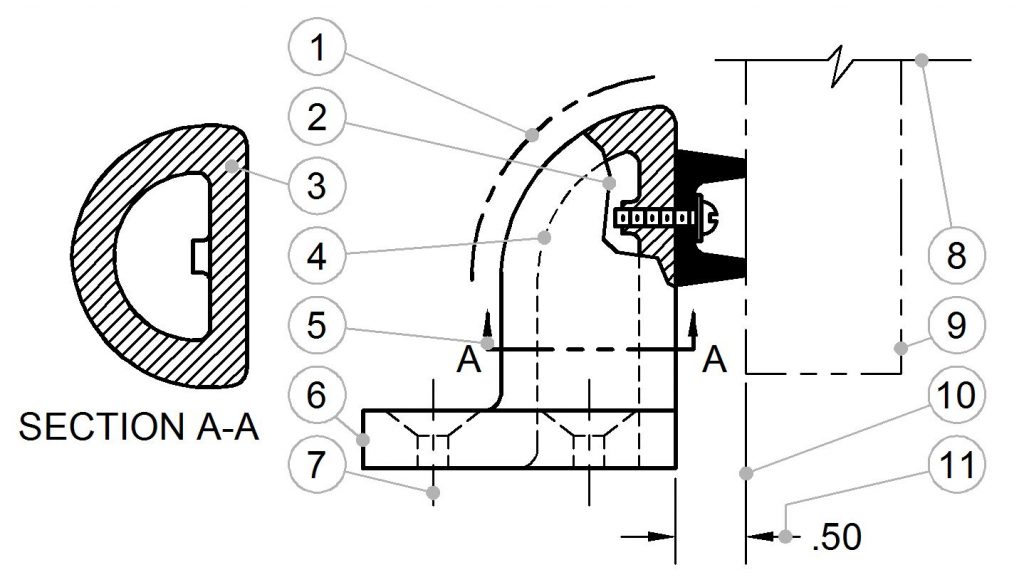
- Chain Line
- Short Break Line
- Section line
- Hidden Line
- Cutting Plane Line
- Visible Line
- Center Line
- Long Break Line
- Phantom Line
- Extension Line
- Dimension Line
Recent Comments